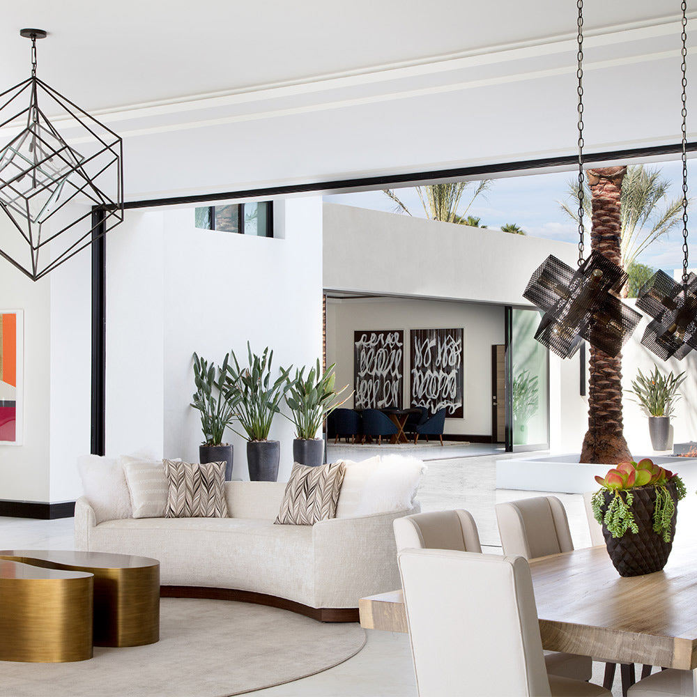
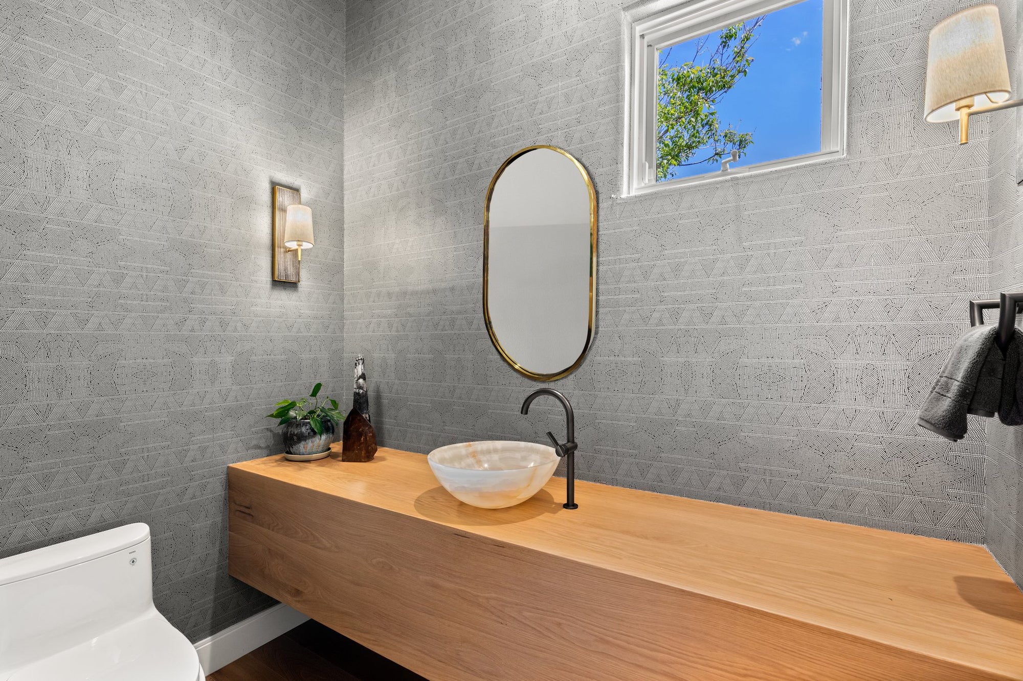
An accented neutral color scheme is an interior design approach that uses neutral tones — whites, grays, beiges, and taupes — as the dominant foundation, then introduces one or more bolder accent colors through fabrics, furniture, artwork, or decor. The result is a space that feels calm and cohesive but has enough contrast and visual interest to feel curated rather than flat. It is one of the most versatile and enduring color strategies in residential and commercial design.
In the world of interior design, opting for an accented neutral color scheme offers a sophisticated balance of subtlety and flair. An accented neutral color scheme primarily uses neutral tones as a foundation while adding a splash of contrasting colors or patterns to capture attention and add visual interest.
This approach allows you to enjoy the tranquility that neutral colors provide, with the added benefit of personalization through selected accent hues. Our team often starts with grays, beiges, and whites to create a calm, inviting atmosphere — then introduces accent colors through fabrics, furniture, or decor items so the space becomes dynamic without overwhelming the senses.
Defining an accented neutral color scheme
An accented neutral color scheme combines neutral tones with a pop of accent color. The goal is a balanced design that adds depth and interest without overwhelming the room.
Understanding neutral colors
Neutral colors form the backdrop. They include whites, grays, beiges, and blacks. These hues are versatile and timeless, providing a calm foundation that supports many styles and makes it easy to highlight accent elements.
Importance of accent hues
Accent hues add the energy. Often they’re contrasting or bolder shades chosen to complement the neutral base and create visual interest. Even small changes — a colorful textile, a painted feature wall, a sculptural accessory — can refresh a neutral space dramatically.
Advantages in interior design
Accented neutrals are popular because they’re flexible and enduring. They can feel elevated, calm, and personal all at once — and they’re easy to update over time.
Visual harmony and balance
Neutrals create a versatile backdrop, while accent colors (pillows, art, decor, furniture moments) provide the contrast. The result is a cohesive look that ties a room together without overwhelming the senses.
Timeless elegance
A neutral foundation stays relevant across years and trends. You can refresh a space seasonally or as your tastes evolve simply by swapping smaller accent pieces.
Psychology of colors
Neutral colors are often associated with calmness and relaxation, creating a serene environment. Accents can then be used to influence mood: blue can feel tranquil, yellow can add warmth and energy, and darker tones can add sophistication.
Choosing the right accents
Selecting accents is where the scheme becomes personal. The best approach is intentional: pick a direction, repeat it, and balance it with the neutral base.
Complementary and analogous colors
Complementary colors sit opposite each other on the color wheel and create vibrant contrast. Analogous colors sit next to each other and create a softer, more cohesive look. Either can work — the key is matching the mood you want.
Incorporating color psychology
Consider how you want a room to feel. Calming hues are great for bedrooms and living rooms, while energizing hues can work in kitchens, dining spaces, and creative areas.
Using the color wheel for selection
A color wheel helps you see relationships between hues so your accents feel intentional rather than accidental. It’s a simple tool that prevents clashing and supports a balanced palette.
Execution: a step-by-step guide
When we build an accented neutral scheme, we start with the room’s natural conditions and then layer in contrast and texture.
Analyzing the space
Lighting, dimensions, and architectural elements influence which neutrals will feel best. Bright rooms can handle cooler neutrals; darker rooms often benefit from warmer neutrals. We also consider function — a living room should feel welcoming, while a home office may benefit from calmer, focus-friendly tones.
Selecting a base neutral palette
Beige, gray, white, and taupe are classic foundations. We often use multiple shades within the same family to create depth without visual noise. Walls, floors, and larger furnishings are usually best kept neutral.
Adding accents strategically
Identify focal points (art, textiles, rugs, lighting, statement furniture) and use accents to guide the eye. Keep accents purposeful so they enhance — not overpower — the neutral foundation.
Design elements and details
Furniture, textiles, and accessories are the levers that make neutrals feel rich and layered.
Furniture selection
Neutral-toned anchor pieces keep the room calm, while one or two accent pieces (a chair, a table, a console) create focus. Natural woods and metals add warmth and help accent colors read more refined.
Textiles and fabrics
Texture is your best friend. Linen, cotton, wool, and woven textiles in neutral shades add softness. Accent colors can come through pillows, drapery, rugs, or patterned upholstery — keep the mix curated so it feels intentional.
Decorative accessories
Artwork, lighting, and smaller objects are perfect for repeating accent hues. Choose a few pieces that echo each other so the story feels cohesive. Reflective surfaces (glass, metal) can also help bounce light and add dimension.
Maintaining aesthetic cohesion
Cohesion comes down to restraint: repeat your accents, distribute them thoughtfully, and avoid adding too many competing colors.
Color placement tips
Weave accent colors across different elements (art, textiles, accessories) so they feel connected. Using multiple accents in the same hue family (for example, two blues) can also improve continuity.
Avoiding common pitfalls
Too many accent colors can create visual discord. Keep it to one or two hues, and place them intentionally rather than scattering them throughout the room. Also consider how daylight and evening lighting will shift color perception.
Want help building a palette that feels calm, elevated, and personal? Explore our services or book a call.